Creating a contact form for your website isn’t just about gathering information; it’s about crafting a seamless experience that compels visitors to engage with your offerings. Imagine a form so well-designed that users eagerly fill it out to learn more about your products and services. With thoughtful design and strategic placement, a contact form can transform into a powerhouse tool for capturing leads and boosting conversions
In this post, we’ll explore the key elements that make a contact form effective and showcase compelling examples to ignite your creativity.
So, first, let us know about the contact form.
What is a Contact Form?
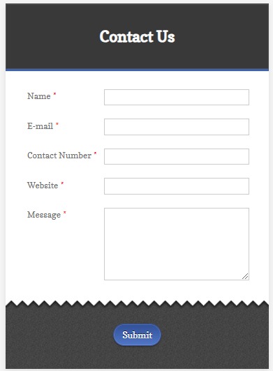
A contact form is a web-based form within a website that enables visitors to communicate directly with the website owner or customer service team. This form usually contains several fields where users can input their personal information and the purpose of their communication. Standard fields include the user’s name, email address, subject of the message, and the message itself. However, contact forms are highly customizable and can be adapted to meet the unique requirements of a business by adding additional fields as necessary. In the context of eCommerce, contact forms play a vital role in facilitating customer inquiries, collecting feedback, and providing customer support.
What Are the Different Types of Contact Forms?
Contact forms are versatile user inputs that can be customized to meet various business needs. Depending on the nature of the interaction required, different types of contact forms serve specific purposes.
The types of contact forms are:
1. Basic Contact Form
A Basic Contact Form is the simplest form and includes fields for the user’s name, email address, subject, and message. Its primary purpose is to facilitate general communication between website visitors and the business, acting as a primary point of contact for any type of inquiry or message.
2. Feedback Form
This form is designed to collect customer feedback, opinions, and suggestions. It typically includes fields for the user’s name, email, feedback category (such as product, service, or website experience), and a text area for detailed feedback. By encouraging customers to share their experiences, this form helps businesses understand customer satisfaction and gather insights on areas for improvement.
3. Support Form
A Support Form allows customers to submit support requests or report issues. It usually includes fields for the user’s name, email, issue category (like technical or billing), a description of the issue, and possibly file attachments for screenshots or documents. This form is essential for customer service, helping to manage and resolve customer issues efficiently by ensuring all necessary information is collected.
4. Sales Inquiry Form
This form enables potential customers to inquire about products or services. Common fields include the user’s name, email, phone number, product or service of interest, and a message field for specific questions. This form helps the sales team identify and respond to potential leads by collecting preliminary information from interested customers.
5. Quote Request Form
It allows customers to request pricing information for specific products or services. Fields often include the user’s name, email, phone number, details of the requested product or service, and additional specifications or requirements. This form is particularly useful in B2B contexts or for services requiring custom pricing, streamlining the process of providing potential customers with cost estimates based on their needs.
6. Newsletter Subscription Form
A Newsletter Subscription Form is used to sign users up for regular updates, newsletters, or promotional emails. It typically requires minimal information, such as the user’s name and email address. This form helps businesses build a mailing list for marketing purposes, keeping their audience informed about new products, services, and company news.
7. Survey Form
A Survey Form is designed to gather detailed information from users, often for market research or customer satisfaction surveys. The fields can vary widely but usually include demographic questions, multiple-choice questions, rating scales, and open-ended questions. This form is valuable for collecting data to analyze customer preferences, behaviors, and satisfaction levels, helping businesses make informed decisions based on user feedback and market trends.
What Are the Benefits of a Contact Form in an eCommerce Store?
Contact forms provide numerous advantages for eCommerce stores, enhancing various aspects of customer interaction and business operations:
1. Improved Customer Service
Contact forms offer a direct line of communication between customers and the business, allowing customers to easily reach out for support, ask questions, or resolve issues. This direct access helps ensure that customer inquiries are addressed promptly and efficiently, enhancing overall customer satisfaction.
2. Lead Generation
Contact forms can capture essential information from potential customers, such as their names, email addresses, and specific interests. By collecting this data, businesses can follow up with interested visitors, turning them into leads and ultimately converting them into paying customers. This process helps grow the customer base and drive sales.
3. Enhanced User Experience
A well-designed contact form simplifies the process for customers to get in touch with the business. Clear, intuitive forms reduce the effort required to communicate, making the overall shopping experience more pleasant and user-friendly. This ease of use can lead to increased customer engagement and retention.
4. Data Collection
Contact forms are valuable tools for gathering insights and feedback from customers. By asking specific questions or including fields for comments, businesses can collect information about customer preferences, opinions, and experiences. This data can be analyzed to inform product development, improve services, and tailor marketing strategies to better meet customer needs.
5. Spam Reduction
When a business publicly displays its email address, it is more susceptible to receiving spam. Contact forms, on the other hand, can be configured with anti-spam measures such as CAPTCHA, reducing the likelihood of spam messages. This keeps the inbox cleaner and ensures that legitimate customer inquiries are not lost among unsolicited emails.
6. Professionalism
A custom contact form adds a level of professionalism to the eCommerce website. It shows that the business is organized and prepared to handle customer communications in a structured manner. This professional appearance builds trust with visitors, making them more likely to do business with the company.
What Should Be Included in a Contact Form? (Essential Components)
A high-quality contact form is an essential feature for any business website, especially for eCommerce platforms. It serves as a crucial bridge between customers and the business, facilitating communication, resolving issues, and building relationships. To ensure effectiveness, a contact form should include several key components, each contributing to a seamless user experience and efficient information gathering.
1. User-Friendly Design
The contact form’s design should be simple, clean, and intuitive. A clutter-free layout with clear labels and ample spacing between fields helps users navigate the form easily. The form should also be responsive, meaning it should work well on both desktop and mobile devices. A user-friendly design minimizes frustration and encourages users to complete the form.
2. Clear Instructions
Providing clear instructions on how to fill out the form is essential. Each field should be properly labeled, and if necessary, examples or placeholders should be included to guide users. Instructions should be concise yet comprehensive, ensuring users understand exactly what information is required in each field. For instance, if you require a phone number, specify the format in which it should be entered.
3. Required Fields
Essential fields collect the basic information needed to respond effectively to the user’s inquiry. Typically, this includes the user’s name, email address, and the message or query they want to convey. These fields should be clearly marked as required, often indicated by an asterisk (*) or a different color, to ensure that users know they must fill them out.
4. Optional Fields
Depending on the nature of your business, you may need additional information to better address the user’s needs. Optional fields such as phone numbers, order numbers, or preferred contact times can be included. While these fields provide valuable context, they should not be mandatory to avoid overwhelming the user or discouraging them from completing the form.
5. Validation
Implementing validation rules is crucial to ensure that all required fields are filled out correctly before the form can be submitted. Real-time validation, where the form provides immediate feedback if a field is incorrectly filled out, can improve the user experience. For example, if an email field is incorrectly formatted, the user should be prompted to correct it before proceeding.
6. Captcha
To prevent spam submissions and ensure that the messages received are from actual users, include a CAPTCHA or another form of verification. CAPTCHA helps distinguish between human users and automated bots, reducing the likelihood of spam. Modern CAPTCHA systems are designed to be user-friendly, often involving simple tasks that are easy for humans but difficult for bots.
7. Confirmation Message
After the user submits the form, it is important to display a confirmation message. This message should inform the user that their message has been successfully received and outline any next steps, such as an expected response time. This confirmation reassures the user that their query is being processed and enhances their overall experience.
10 Good Custom Contact US Page Page/Forms Examples
Examples of well-designed contact forms are:
1. Apple
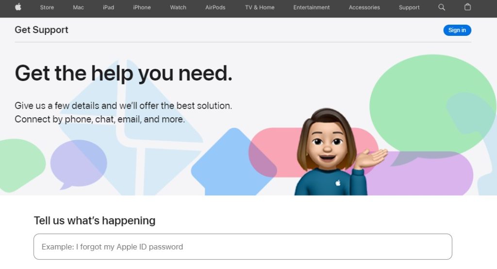
Apple’s contact form is sleek and minimalistic, aligning with its brand aesthetic. It includes clear fields for name, email, subject, and message, with a simple layout that focuses on ease of use and clarity.
2. Airbnb
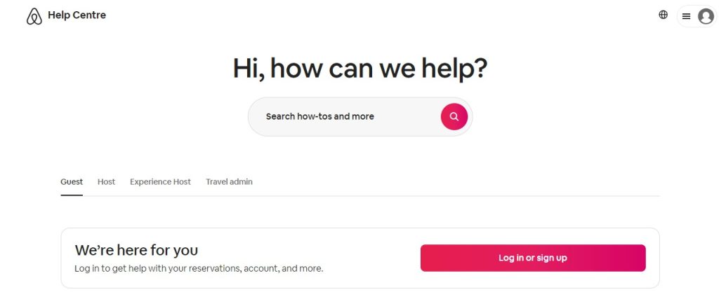
Airbnb’s contact form is user-friendly and comprehensive. It incorporates dropdown menus for selecting the type of inquiry (e.g., booking assistance, hosting support), along with specific fields tailored to each category to streamline the support process.
3. Hubspot
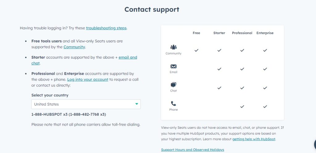
Hubspot contact form is customizable and integrates seamlessly with their CRM platform. It allows businesses to add custom fields based on their specific needs, ensuring they capture relevant information for effective follow-up and lead nurturing.
4. Etsy
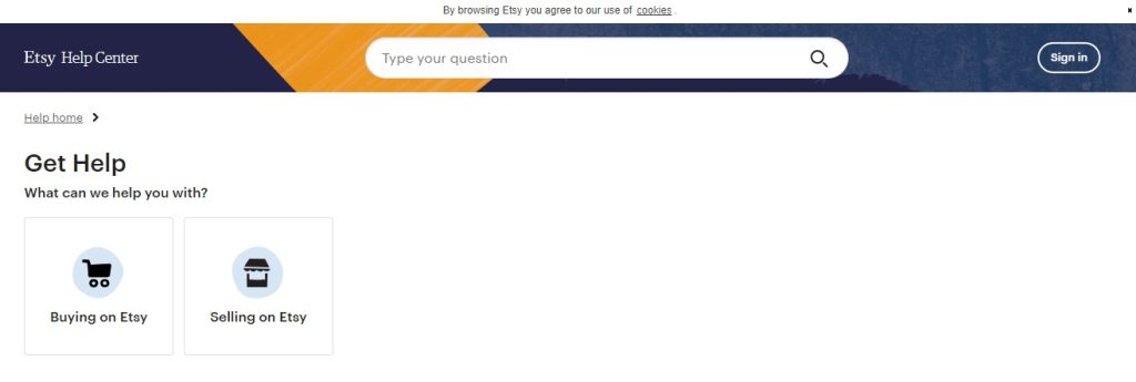
Etsy’s contact form is designed for both buyers and sellers. It accommodates inquiries related to orders, account assistance, and technical support. It features checkboxes and dropdown menus to categorize issues and guide users to the appropriate support team.
5. Squarespace
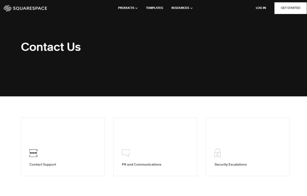
Squarespace’s contact form is elegant and intuitive, reflecting its commitment to clean design. It includes options for general inquiries, billing support, and technical issues, with straightforward fields for essential contact information and detailed messages.
6. Zendesk
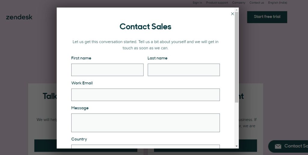
Zendesk contact form is integrated with their help desk software, offering advanced features such as automatic ticket creation and routing based on user inputs. It ensures efficient handling of customer support requests while maintaining a user-friendly interface.
7. SurveyMonkey
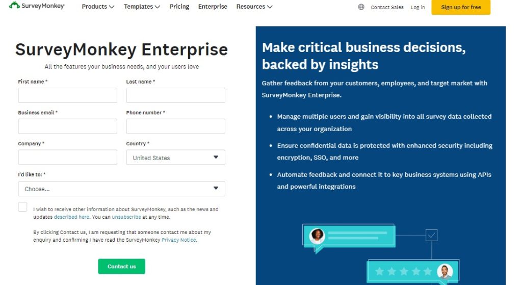
SurveyMonkey’s contact form is tailored for requesting support or sales inquiries related to their survey platform. It includes dropdown menus for selecting the type of request alongside fields for detailed descriptions and contact information.
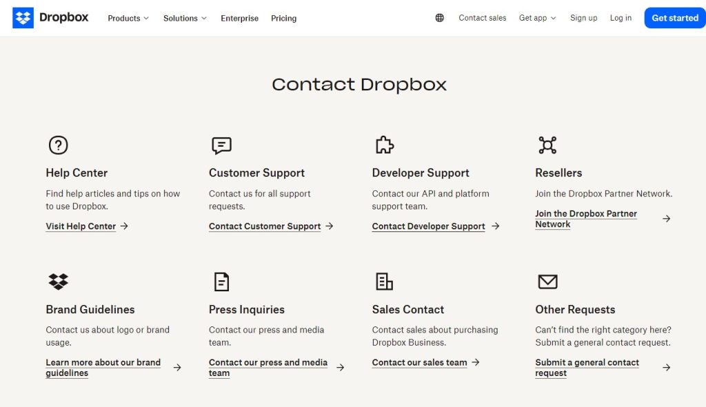
8. Dropbox
Dropbox’s contact form emphasizes simplicity and functionality. It provides options for technical support, billing inquiries, and account assistance, with clear instructions and validation to ensure accurate information submission.
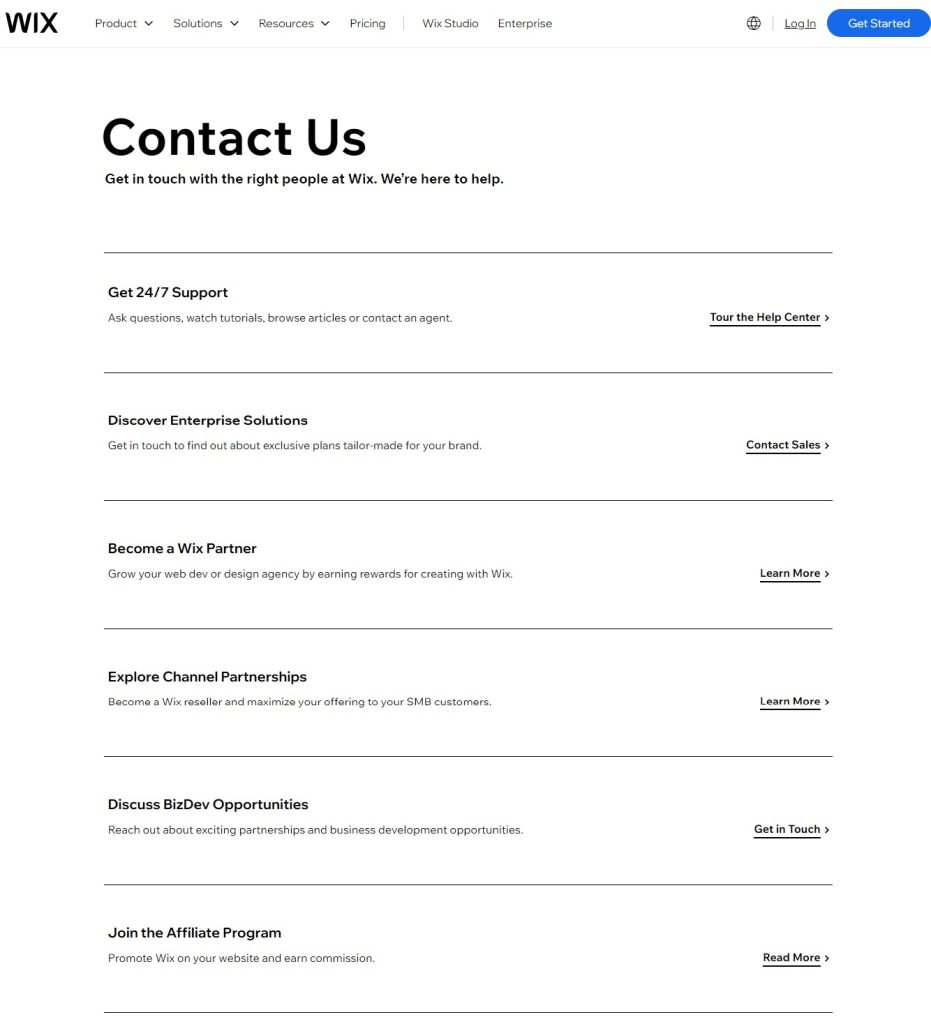
9. Wix
Wix’s contact form builder allows users to create customized forms tailored to their website’s needs. It offers a range of templates and widgets, including fields for collecting visitor feedback, appointment scheduling, and customer inquiries.
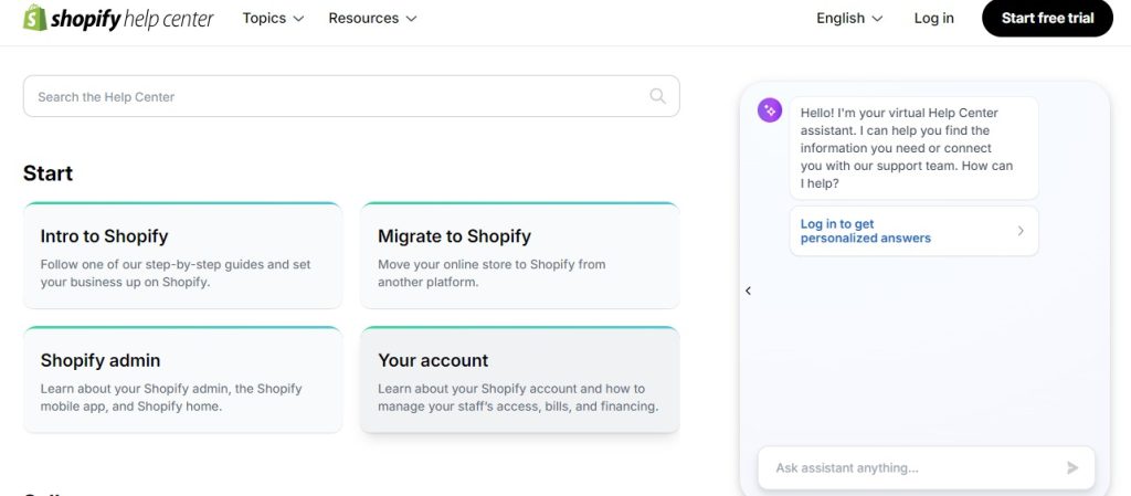
10. Shopify
Shopify’s contact form is designed for merchants and customers alike. It supports inquiries related to orders, store setup, and technical support. It includes dropdown menus for selecting specific topics and fields for order numbers, enhancing the efficiency of customer support interactions.
Tips for Designing a High-converting Contact Form for Your eCommerce Store
1. Keep It Simple: Only ask for necessary information to avoid overwhelming users.
2. Use Clear Labels: Ensure each field is clearly labeled and easy to understand.
3. Mobile Optimization: Make sure the form is responsive and works well on mobile devices.
4. Quick Loading Time: Optimize the form to load quickly to keep users engaged.
5. Include a Call-to-Action: Encourage users to submit the form with a compelling call-to-action.
6. Test Regularly: Regularly test the form to ensure it works correctly and is free of bugs.
7. Offer Multiple Contact Methods: In addition to the form, provide options for live chat, phone support, and email.
How to Create a Custom Contact Form in Magento 2
To create a Custom Contact Form in Magento 2, follow these steps:
Step 1. Install the Contact Form Extension
Start by browsing the Magento Marketplace for a suitable Contact Form extension that meets your requirements. Various extensions are available, offering different features such as customizable fields, spam protection, and integration options.
Step 2. Navigate to the Form Builder
Once you have selected and installed the extension, access the form builder tool through the Magento admin panel. This tool will be part of the extension’s settings or configuration options.
Step 3. Customize the Form
Use the form builder interface to customize the contact form according to your business needs. You can add fields such as name, email, phone number, subject, message, and any other relevant information. Arrange these fields in the desired order and configure them to be either required or optional.
Step 4. Configure Form Settings
Set up additional settings for the form, including email notifications that notify specified recipients when a form is submitted. Configure confirmation messages that users will see after submitting the form, providing reassurance that their message has been received. Implement validation rules to ensure that all required fields are properly filled out before submission.
Step 5. Add the Form to Your Website
After customizing the form, decide where on your Magento 2 website you want to display it. Most extensions offer options to embed the form using widgets or provide shortcode snippets for direct integration into CMS pages, blocks, or custom templates.
Step 6. Test the Form
Thoroughly test the form’s functionality before making it live. Submit test entries to ensure that data is captured correctly and that email notifications are received as expected. Verify that validation rules work properly and that the form behaves as intended across different devices and browsers.
Wrapping it Up
Take inspiration from the diverse examples highlighted above and infuse your contact form with creativity and functionality tailored to your eCommerce store. Whether you’re using Magento 2 or another platform, remember that every interaction counts. Invest in a contact form that not only captures inquiries but also leaves a lasting impression, setting the stage for lasting customer relationships and business growth.

