It’s important to give your customers a great experience. One way to do that is by having a really helpful FAQ page. In this blog, we’ll talk about 15 examples of FAQ pages from other online stores. We’ll explain what they’re doing right and give you some tips to make your own FAQ pages shine.
What is a FAQ Page?
An FAQ(Frequently Asked Questions) page is like the Swiss Army knife of your eCommerce website. It’s that one-stop destination where your customers can find answers to all the common queries buzzing in their minds.
For eCommerce website owners, an FAQ page is pure gold. It’s where you can preemptively tackle those repetitive questions that flood your inboxes day in and day out. By addressing concerns like shipping policies, returns, product specifications, and anything else your customers might wonder about, you are saving time for both them and yourself.
Why do you need a FAQ Page?
As a busy eCommerce store owner, you must manage inventory, marketing campaigns, customer inquiries, and everything else that comes with running an online business. Amidst this chaos, one thing can be your saving grace: the FAQ page.
First and foremost, an FAQ page serves as a virtual customer service representative, working tirelessly around the clock to answer common questions and alleviate concerns. When a potential buyer lands on your website, they’re bound to have multiple questions. Instead of bombarding your inbox with these inquiries, why not have the answers readily available?
By curating a comprehensive FAQ page, you’re providing a self-service option for your customers. They can easily find the information they need without having to wait for a response or pick up the phone. This not only enhances the overall customer experience but also frees up your time to focus on other critical aspects of your business.
But it’s not just about convenience; it’s also about trust. Imagine you’re shopping online for a new gadget, and you stumble upon a website with no FAQ page. You start to wonder about the return policy, the warranty, and whether the product will meet your expectations. Without clear answers to these questions, you might hesitate to make a purchase. On the flip side, when you come across a website with a well-crafted FAQ page that addresses all your concerns upfront, you feel more confident about hitting that “Add to Cart” button.
An FAQ page is your opportunity to proactively address potential barriers to purchase. Whether it’s clarifying shipping costs, explaining how to use a product, or assuring customers about the security of their personal information, every question answered is a step closer to closing the sale.
Moreover, an FAQ page can also serve as a valuable SEO tool. When someone types a question into a search engine, wouldn’t you want your website to pop up with the answer? By strategically incorporating relevant keywords and phrases into your FAQ page, you can improve your chances of ranking higher in search results and driving organic traffic to your site.
Not to mention, an FAQ page can help reduce the burden on your customer support team. Instead of fielding the same questions over and over again, they can focus on more complex inquiries or provide personalized assistance to customers with specific needs. This not only increases efficiency but also enhances the quality of support you’re able to deliver.
10 FAQs your eCommerce Website Needs
Here are 10 FAQs that your eCommerce website absolutely needs:
1. How long will it take for my order to arrive?
This is one of the most common questions customers have when shopping online. Providing an estimated delivery time frame helps manage expectations and reduces anxiety about when their purchase will arrive.
2. What payment methods do you accept?
Customers want to know if their preferred payment method, such as credit/debit cards, PayPal, or other options, is accepted on your website. Clear information about payment methods can prevent abandoned carts and increase conversion rates.
3. What is your return policy?
Nobody likes the hassle of returning a product, but it’s reassuring to know that the option is available if needed. Clearly outlining your return policy, including details about time frames, the condition of the item, and any associated fees, helps build trust among customers.
4. Do you offer international shipping?
For customers outside your home country, knowing whether you offer international shipping and what the associated costs and delivery times are is crucial. Providing this information upfront can attract a broader audience and prevent confusion during the checkout process.
5. How can I track my order?
Once a customer has made a purchase, they’ll want to keep tabs on its journey to their doorstep. Providing a link or instructions for tracking orders helps customers feel informed and in control of their purchase experience.
6. Are my personal details secure?
With data breaches and online fraud becoming increasingly common, customers are understandably concerned about the security of their personal information. Reassure them by explaining the measures you take to protect their data, such as SSL encryption and secure payment gateways.
7. What if I have a problem with my order?
From missing items to damaged goods, issues can arise during the shipping and delivery process. Let customers know how they can reach out to your customer support team for assistance, whether it’s via email, phone, or live chat.
8. Can I cancel my order?
Sometimes, customers change their minds or realize they’ve made a mistake shortly after placing an order. Clearly stating your cancellation policy, including any deadlines or conditions, helps customers understand their options and reduces frustration.
9. Do you offer discounts or promotions?
Who doesn’t love a good deal? Let customers know if you offer discounts, promotions, or loyalty programs and how they can take advantage of these offers. This can incentivize purchases and encourage repeat business.
10. How do I contact customer support?
Lastly, make it easy for customers to contact your support team with any questions, concerns, or feedback they may have. Provide clear contact information, including email addresses, phone numbers, and hours of operation.
15 Standout eCommerce FAQ Page Examples
Now, let’s go through some examples of effective FAQ pages that you can refer to for your eCommerce website.
1. Zappos:
If you’ve ever had questions about ordering shoes or clothes online, Zappos has your back with their FAQ page. They’ve made it super easy to find answers about things like shipping, returns, and managing your account. Also, they use language that feels like chatting with a friend, making the whole experience a breeze.

2. Amazon:
Amazon’s FAQ page is like a giant library filled with answers to all your burning questions about shopping online. Whether you’re wondering about delivery or returns or just need some help navigating the site, they’ve got you covered. They even throw in helpful pictures and videos to make things crystal clear.

3. Etsy:
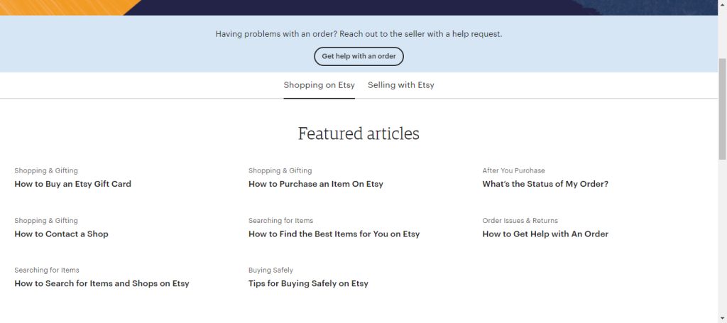
If you’re part of the Etsy community, their FAQ page is like a trusted friend offering advice. Whether you’re buying or selling unique handmade items, they’ve thought of everything. And they do it all with a supportive tone that makes you feel like you’re in good hands.
4. REI:
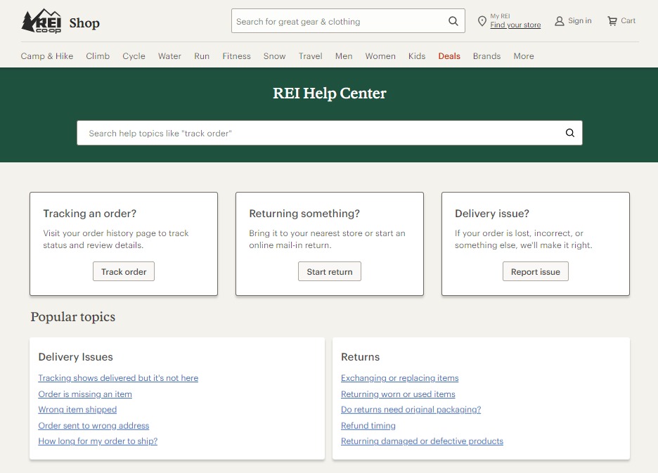
REI’s FAQ page is like having a seasoned adventurer by your side, answering all your gear-related questions. From taking care of your equipment to getting the most out of your membership, they speak your language and make sure you’re ready for your next adventure.
5. Warby Parker:
Warby Parker’s FAQ page is the place to be. They’ve got all the info you need about ordering glasses, trying them on, and even what to do if something goes wrong. And they do it all with a sense of style that matches their cool glasses.

6. Patagonia:
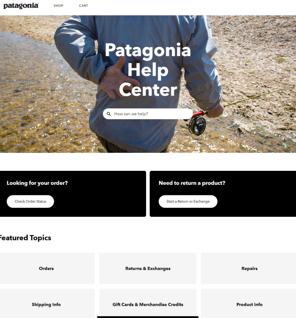
If you care about the environment, you’ll love the Patagonia FAQ page. It’s all about sustainability and ethical business practices, and it covers everything from taking care of your gear to repairing it when it needs some love. Also, it does it all in a down-to-earth tone that makes you feel like you’re part of the solution.
7. Nordstrom:
Nordstrom’s page is like having a personal shopper at your fingertips. They’ve got answers to all your questions about shipping, returns, and even personal styling services. And they do it all with a touch of class that matches their upscale brand.

8. Apple:
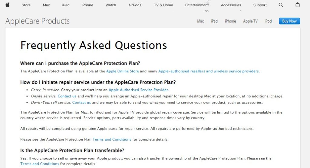
The Apple FAQ page is like having a genius bar in your pocket. It has detailed answers to everything from how to use your iPhone to troubleshooting your Mac. And it explains it all in language that even your grandma can understand.
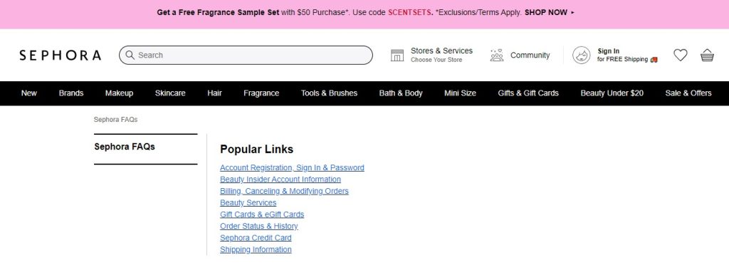
9. Sephora:
Sephora’s page is like a treasure trove of makeup tips and skincare advice. Whether you’re wondering how to apply the perfect winged eyeliner or just need some help with their loyalty program, they’ve got your back. And they do it all with a fun and informative tone that’s as addictive as trying on a new lipstick.
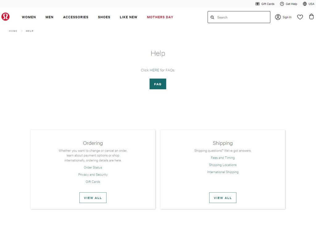
10. Lululemon:
Lululemon’s FAQ page is like having a personal trainer in your pocket. It answers all your questions about workout gear, sizing, and even how to get involved in your local fitness community. And it does it all with a supportive tone that motivates you to reach your goals.
11. Netflix:
Netflix and Chill is even better with their FAQ page. It answers all your questions about streaming, from how to manage your account to what to watch next. And it does it all in a casual tone that feels like chatting with a friend about your favourite shows.

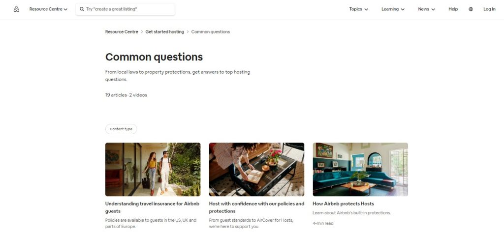
12. Airbnb:
The Airbnb FAQ page is like having a travel expert on speed dial. It has answers to all your questions about booking, cancellations, and staying safe while you travel. And it does it all with a friendly tone that makes you feel like you’re part of the Airbnb family.
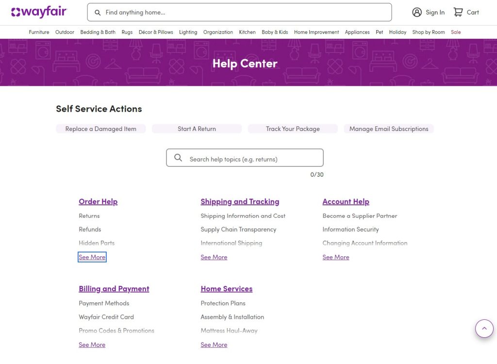
13. Wayfair:
Wayfair’s FAQ page is like having an interior decorator on call. They’ve got answers to all your questions about furniture, delivery, and returns, making it easy to shop for home goods online. And they do it all with a helpful tone that puts your mind at ease.
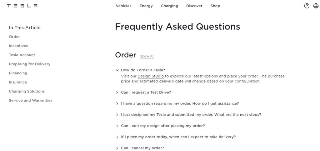
14. Tesla:
The Tesla FAQ page is like having a conversation with a visionary. It has answers to all your questions about electric vehicles, from how they work to where to charge them. And it does it all with a forward-thinking tone that makes you excited about the future of transportation.
15. Casper:
Casper’s page is like having a sleep expert by your side. They have answers to all your questions about mattresses, sleep trials, and warranties, making it easy to find the perfect bed for you. And they do it all with a friendly tone that understands the importance of quality rest in your life.

How to create an effective eCommerce FAQ page for your store?
Creating an effective eCommerce FAQ page for your store is crucial for providing excellent customer service and boosting sales. Here’s how to do it in simple steps:
- Understand Your Customers: Start by understanding your customers’ most common questions and pain points. Look at customer inquiries, reviews, and feedback to identify recurring themes. Knowing what your customers want to know will help you create a relevant and useful FAQ page.
- Choose the Right FAQ Extension: When building your FAQ page, consider using a reliable FAQ extension or plugin if you’re using a platform like Shopify, WooCommerce, or Magento. Choose one that offers customizable templates, easy navigation, and responsive design to ensure compatibility with various devices.
- Organize Your Content: Structure your FAQ page so that customers can easily find answers to their questions. Group similar questions together under relevant categories or topics. For example, if you sell electronics, you might have categories like “Shipping & Delivery,” “Product Information,” and “Returns & Exchanges.”
- Write Clear and Concise Answers: Write your answers in plain language that is easy for customers to understand. Avoid jargon or technical terms that may confuse them. Be concise but comprehensive, providing enough information to address the question thoroughly without overwhelming the reader. Use bullet points or numbered lists to break up long paragraphs and make the content more scannable.
- Include Visuals if Necessary: Sometimes, a picture is worth a thousand words. If you can clarify a concept or answer a question more effectively with visuals, such as screenshots, diagrams, or instructional videos, don’t hesitate to include them. Visuals can enhance understanding and make your FAQ page more engaging.
- Update Regularly: Keep your FAQ page up to date by regularly reviewing and updating it with new information. As your business grows and evolves, so will your customers’ questions. Stay proactive by monitoring customer inquiries and feedback and incorporating any new or relevant information into your FAQ page.
- Make it Searchable: Implement a search function on your FAQ page to allow customers to quickly find answers to specific questions. This feature can save them time and frustration, improving their overall experience on your website. Ensure that the search bar is prominently displayed and easy to use.
- Promote Your FAQ Page: Once your FAQ page is live, promote it across your website, social media channels, and email newsletters. Encourage customers to visit the FAQ page before reaching out to customer support for assistance. By proactively directing them to your FAQ page, you can reduce the workload on your support team and empower customers to find answers on their own.
- Monitor Performance: Analyze metrics such as page views, search queries, and customer feedback to monitor your FAQ page’s performance. Use this data to identify areas for improvement and make adjustments as needed. Continuously optimizing your FAQ page will ensure that it remains an effective resource for your customers.
Conclusion:
Crafting a killer FAQ page for your eCommerce site is totally worth it. By following the tips we’ve shared and taking inspiration from those awesome examples we’ve seen, you can create a FAQ page that’s not just helpful but also shows off your brand’s personality and how much you care about your customers.

